
Stop losing implant patients to hidden costs. Get fresh DDS marketing branding tips for new dental graduates & owners. Claim your free website conversion audit today.
Learn More
As a medical student and web designer, I’ve sat on both sides of the stethoscope. I’ve seen perfect clinical cases fall apart because a patient couldn't navigate a clunky website. Most patients today "vibe-check" your clinic online before they ever pick up the phone. If your site feels outdated, they assume your equipment is, too.
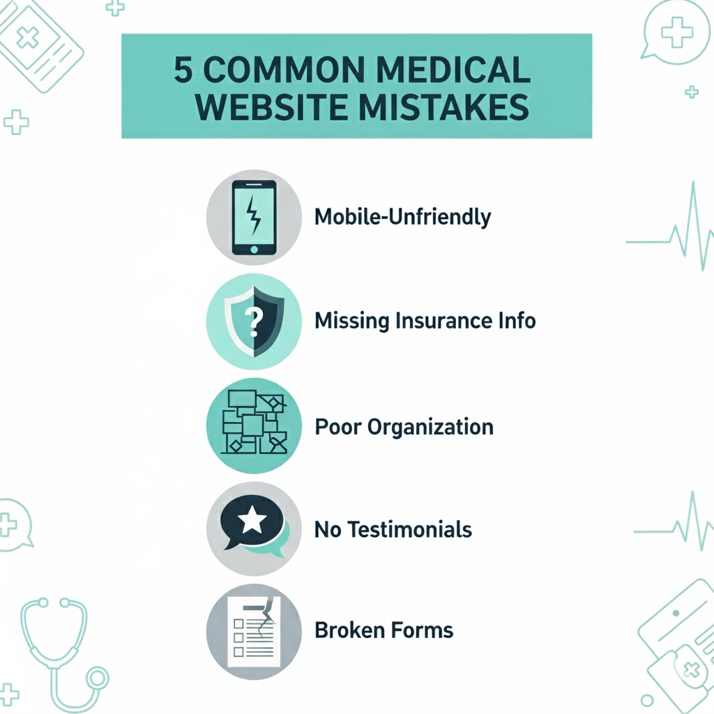
A poorly designed medical website isn't just an eyesore—it’s a leaking funnel costing you 20+ new patient starts every single month. Here are the 5 hidden technical mistakes killing your clinic’s growth.
Most doctors check their own website on a desktop, but 65% of your patients are trying to book from an iPhone in the school pickup line or on their lunch break.
Patients aren't just looking for a doctor; they’re looking for a doctor their insurance covers. If they can't find that answer in 10 seconds, they’re gone.
Doctors write for doctors. Patients search for relief.
The average time on page for a website is between 52–54 seconds. This means your clinic’s service page has less than a minute to capture a potential patient’s interest and guide them toward a booking (though average time on page varies significantly by industry and content type. For full information, visit Search Engine Journal.).
According to a 2017 study by Software Advice, 61% of U.S. patients utilize online reviews to inform their choice of a healthcare provider. This research indicates that online reviews are a critical part of the modern patient's decision-making process.
Did you know that 60% of patients define an "immediate" response as 10 minutes or less? If your contact form sends an email to a generic inbox that no one checks, you’re throwing money away.
Optimize your contact system:
Most clinic owners look at their website as a monthly expense—a line item for hosting and maintenance. In reality, a poor website is a passive revenue drain.
Let’s look at the math of that "20+ patients" loss. If your average patient lifetime value (LTV) is $1,000—considering initial consults, follow-ups, and referrals—losing 20 patients a month isn't just a minor glitch. It is a $20,000 monthly leak in your practice's bucket. Over a year, that is $240,000 in unrealized revenue.
When a patient hits a "broken" contact form or a non-responsive booking page, they don't wait. They click the back button and go to the next result on Google. You aren't just losing a lead; you are actively funding your competitor’s growth by sending them your frustrated traffic.
In the medical world, we are taught that trust is built at the bedside. But in the digital age, trust is built at the first click.
If a patient sees a website that is slow, has broken images, or lacks clear insurance information, their subconscious makes a clinical judgment. They think: "If they can't manage their website, how will they manage my surgery?" As a medical student, I’ve seen how patient anxiety can be mitigated by clear communication. Your website is your first opportunity to lower a patient's cortisol levels by providing a seamless, professional experience.
1. Is online booking truly HIPAA-compliant?Yes, but only if you use a dedicated medical scheduler. Standard "off-the-shelf" plugins for WordPress often store data in unencrypted databases. To stay compliant, you must use platforms like Zocdoc, NexHealth, or customized Jotforms that offer a Business Associate Agreement (BAA).
2. How often should a clinic update its service pages?At a minimum, every 6 months. Medical guidelines, insurance providers, and technology change. Updating your content signals to Google that your clinic is active and providing the most current medical advice available, which boosts your local search ranking.
3. Will adding video testimonials violate patient privacy?Not if handled correctly. You must have a signed Media Release Form that specifically mentions the use of their likeness for marketing purposes. Many patients who have had life-changing results are actually eager to share their stories to help others in similar pain.
4. What is the "Golden Ratio" for a medical landing page?A high-converting page follows the 20/80 rule: 20% clinical details (for credibility) and 80% patient-focused outcomes (addressing pain, recovery time, and costs).
Your website isn't just a digital brochure it's a critical patient acquisition tool. By fixing these 5 mistakes, you can build a website that truly fills your appointment book.

Get a free 15-minute website audit to see how we can help your clinic fill appointment books, reduce no-shows, and convert more visitors into booked patients just like the clinics we’ve worked with.
kindly insert your email below to recieve our Clinic website optimization guide explaining tips that can make your website super optimized to maximumize patient booking and patient aquisation

Our Blogs
Stop losing implant patients to hidden costs. Get fresh DDS marketing branding tips for new dental graduates & owners. Claim your free website conversion audit today.
Dental ad agency vs. in-house? Stop losing implant cases to hidden financing. Get expert growth strategy & a free website conversion audit today.
Connect with our team to build a high-converting clinic website. Learn More
